Ansel Adams taught the world how to create an interesting visual path in a photograph with subtle tonal variation. The journey of the viewer's eye in an Adams photo is like a leisurely stroll along a country road. I was fortunate to find his five book basic photo series - Camera and Lens, The Negative, The Print, Natural Light Photography, and Artificial Light Photography - at my college bookstore in 1970. They were my introduction to the concept of process control and the foundation of my photographic knowledge.
Monte Zucker revolutionized wedding photography in the 1970s by creating simple but elegant short-lit low-key background portraits which strongly isolate a single center of interest. In Monte's work the path of the viewers eye to the center of interest is like being shot out of a cannon towards a bulls-eye target. I worked as his apprentice and assistant from 1972-4.
It was many years later that I realized there was a common thread in both of their approaches; the use of contrast to lead the eye of the viewer. More importantly I realized that the key to controlling the strength of the attraction in a portrait wasn't the tone of the center of interest but rather the much larger background and clothing areas.
A face will have no visual impact a dark background if there is a large white shirt beneath it...
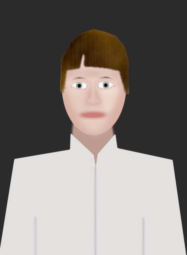
...but it will on a white background.
It is the dominant background tone which creates the baseline for contrast in the photo. If the background is predominantly low-key or dark the viewer will be attracted to lighter areas. If the background is predominantly high-key or white the viewer will be attracted to darkest most colorful areas. If the background is middle toned significantly darker and lighter areas will fight each other for attention leading to a visual ping-pong match which can be effective if planned intentionally or a huge distraction if its not.
Color contrast is also an important factor. A background color which contrasts with the skin tone of the subject will make the face of the subject more visually attractive than one which causes the face to get lost in it. Bluish or "cool" backgrounds will create needed contrast with warm caucasian skin tones.

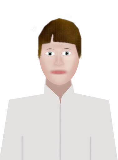
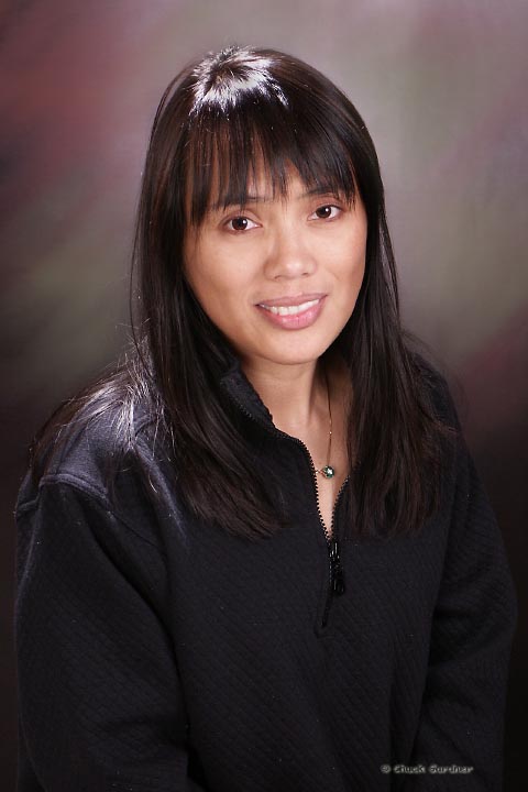
But there is also a need for the background to coordinate with the clothing while at the same time contrasting with the color and tone of the face. In the photo above the blue gel in the background light created contrast with the face providing good contrast and separation, but the shirt and face blend together. This is more clearly seen if the entire image is converted into an abstract tone map using Gaussian blur in Photoshop.

When blurred it is easy to see the forehead and both cheeks are both dominant and symmetrical in appearance but the shoulder shirt is nearly identical. It's easy to find the person on the background but more difficult to find the face in the person.
Clothing, not lighting or background needs to lead the overall strategy for creating a visually effective photo because it is the one variable the photographer usually cannot control unless there is an opportunity for a clothing consultation in advance of the sitting.
The best approach when confronted with a clothing challenge is to find a way to make the clothing and background blend in together. A white background and a variety if colored gels makes this a relatively simple process. Here I just substituted a straw gel for the blue one used for the shot above. Back/rim light is effective for creating separation between the shirt and the similar background.

When the Gaussian blur test is apply to it you can see that the shirt and background blend together almost seamlessly and the head becomes the darker more dominant tonal area. By no means an ideal combination, but far better than the blue background.

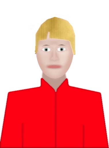
Red is a very difficult color to deal with because it is both a primary color which triggers a strong sensory response and a warm tone similar to a caucasian skin tone. A red shirt in a portrait will overwhelm the face.
A red hat will also be a distraction from the face.
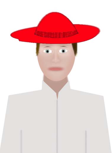
There are two effective strategies for dealing with bright distracting clothing. The first is balance. Place the face between two strong distracting color areas and the eye will tend to tune out the color as "background" and be drawn to what is different; the skin tone in the middle. Red shirt? Just add a red hat.
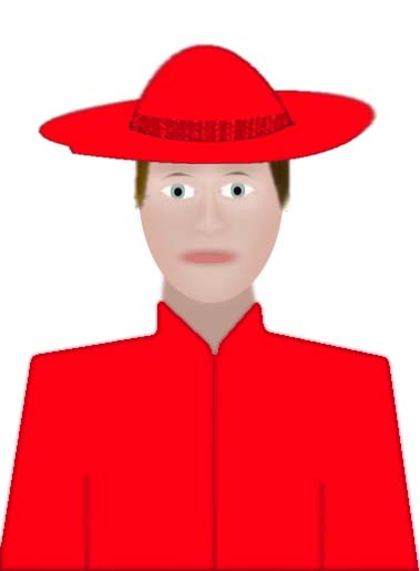
Another effective strategy for dealing with bright distracting clothing is to make the background a similar color. As with the tan shirt example above viewer's brain will tune out the dominant red color and search for what contrasts with it. Here the contrast is much stronger than in the tan background example.

Winding Road vs Cannon Approach
It is important to have a destination in mind for the viewer's eye when you compose and light a photograph. I call that destination the center of interest. Hopefully by now you are convinced of the role tonality plays in attracting the eye and how it is the background, not the light on the center of interest, which controls where the viewer's eye will be attracted. Therein lies the secret of predicting and controlling eye movement; modulation of the background.
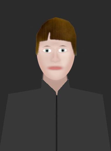
In the illustration above there is very strong contrast between the face, clothing and background. The clothing is non-distracting; darker than the darkest skin tone and lighter than the background. It's effective in guiding the viewer's eye to the face quickly, but there's no subtlety.
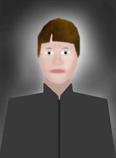
The role of the background light on a dark background is modulate its appearance, not illuminate it evenly. It is very desirable to have the edges of a low-key dark background dark and out of focus and the center area behind the subject's head brighter to draw the viewer into the photo from the edges towards the face. More importantly the dark uninteresting edges create a visual buffer of negative space which prevents the viewer's eye from wandering out of the photo.
Vignetting for dark backgrounds
Vignetting is a technique which has been used in art and photography for centuries to guide the viewers eye into the center of the picture and keep it there. Even when a subject has an extremely compelling center of interest the viewer's eye will eventually tire of looking at it and begin to search for anything else which is interesting. A better approach and the whole point of modulating the background in a portrait is to lead the viewer's eye over the areas of secondary interest on the way to the face. On a dark background that can be accomplished by making every path in the photo, such as the leading lines of arm angled into the bottom corners, dark near the edges of the photo and progressively lighter towards the face.
Vignetting for white backgrounds
Vignetting is equally effective for portraits taken on high-key or white backgrounds. But because the tonal balance is opposite that of a low-key dark background it is necessary to progressively lighten the photo from the center of interest outwards. I cover this in-depth in other tutorials, but it is worth noting here that on white the center of the subject's face should be warm and saturated in tone, not brightly lit as on a dark one. The reason is simple, as always, contrast. The darkest area the white background will attract the most attention.
Vignetting while shooting
Vignettes of white backgrounds are most easily done in Photoshop with a mask or just by erasing with a soft low-pressure brush tool. Vignettes can also be done while shooting by aiming the key light slightly away from the face towards the bottom of the photo as shown in the illustration above. Accent kickers are commonly used in glamor shots to create rim highlights on the sides of the face and body. They make the edges of the subject blend with the background, drawing attention to the darker contrasting center and making it look slimmer.
There are many techniques which can be employed while shooting to create a vignette on dark background. Here are commonly used ones. (If you know any other good ones let me know and I'll add them.)
- Modifier Size - Umbrellas and huge softboxes are ideal for wrap around lighting, but will evenly illuminate everything. A medium or small softbox will provide better control of where the light is hitting the subject.
- "Feathering" the key light - By aiming it with the edge of its cone of illumination rather aim the center of the light at the subject's nose is one technique which is a good one to use whether or not a vignetter is desired.
- Masks, Grids and Snoots - These are all devices for restricting the spread of light. I use a circle mask on a medium softbox as key light for portraits on low-key backgrounds and a small softbox with a circle mask and 40-degree fabric "egg-crate" grid for my hair light.
- Flags and Gobos - These are black panels, often with a saw-tooth pattern in their edges to prevent harsh shadows, placed between the key light and the subject to block light selectively.
- Lens shade vignetters - Typically an extra large square lens shade with a slot in the front allowing saw-toothed cutouts to be placed in front of the lens creating dark out of focus edges. This can also be done on prime lenses by just putting some black masking tape in a V or U shape on the front of the lens hood. It may not work with zoom lenses.
Vignetting in Photoshop
Vignettes can also be created in Photoshop very easily. I'm planning to write a tutorial for the technique I use, but here are the steps for those familiar with layers and masks:
- Set foreground color to black, background to white
- Open Layers window
- Dupe background layer
- Change dupe layer to "multiply"
- Alt+click [o] mask icon on bottom of layers window to create black filled mask over multiply layer. Make mask layer active.
- In edit window erase over the image edges with erasers tool - soft airbrush with pressure less than 20
- Adjust opacity slider on multiply layer by eye.
A photo which is vignetted shouldn't shout VIGNETTE!!! to the viewer. Ideally it should be so subtle it works but is not really noticed. If the person in the photo appears to be floating on a cloud or a cannon ball hurling through the inky darkness of outer space you've probably overdone the vignetting.
Allowing some empty or "negative" space around a subject provides balance and a buffer. The more negative space there is the less vignetting is necessary to achieve an overall visual balance in the composition of the photo. It is not always possible to provide negative space; a tight facial close-up for instance. In situations like that I will provide a buffer of negative space with a mat which matches the background color, or is slightly darker (dark backgrounds) or lighter (white ones). I find that the easiest way to achieve good visual balance is to apply "rule of thirds" cropping to the combined photo and mat. I make the mat larger than needed then crop by eye.

There is a need for a "negative space" visual buffer in all types of photos, not just portraits. It is very important to keep distractions and leading lines away from the edges of the photo lest they lead the viewer out of the photo. Pose a person next to a tree or a post and the viewer will sooner or later follow that strong vertical leading line out the top of the photo. Pose an arm gracefully and then cut the hand in half with the edge of the photo and the viewer will follow the leading line of the arm and get stranded at the end of it with no visual payoff and no compelling path back to the face. Think vignette even if you don't use one.
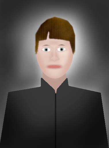
This is the original for the above photo:

Controlling the background without a background light
Some portrait backgrounds are painted so the edges are darker than the middle. When camera axis fill is used with this type of background there usually isn't a need for a separate background light. Light intensity falls off about 2-f/stops each time the distance from the light is doubled which allows the rate of fall off to be predicted and controlled using the fill-to-subject distance as the baseline. Moving a light progressively farther away, from 2, 4, 5.6, 8, 11, 16 feet, will decrease the light by 1-stop at each increment. Those distances are easy to remember because they are the same as f/stop numbers.
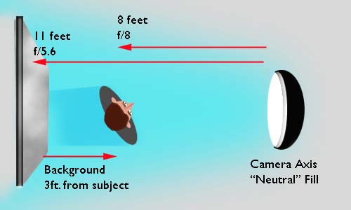
Lets say you don't have a background light and want the background to appear 1-f/stop darker than the shadows on your subject created by the fill. When the fill is 8ft. from the subject and measures f/8, the background must be placed at 11ft. to get the desired fall-off. That only leaves a 3ft. gap which really isn't enough for good visual separation.

But thanks to the mathematical magic of the inverse square law, if the fill-subject distance is increased to 11ft. and the power level of the fill light is raised to keep it f/8 on the subject it will take 5 feet for the light to fall-off by 1-stop. Perfect for a head and shoulder portrait.
Other Photoshop techniques
Neutral background such as white, gray and black are good to have on hand because they don't clash with any color and can be changed to color coordinate with the clothing by using a background light equipped with gels as in the tan and blue background shots above.
Another technique I've used is to shoot the subject on a black background and then paint in an abstract pattern of color to match the clothing or just add some contrast as in the shot below.
The technique is simple. Create a new transparent layer over the background. Use large soft paint brush tools to dab in random dots of color it the background and over the edges of the subject. Then blur the layer with directional blur followed by Gaussian blur or anything else on the filters menu that looks fun like Render-Clouds. Adjust the overall look of the color layer with the opacity slider. Finally take the eraser tool and remove the parts of the layer which covers the subject, leaving a bit of overlap to soften the edges.
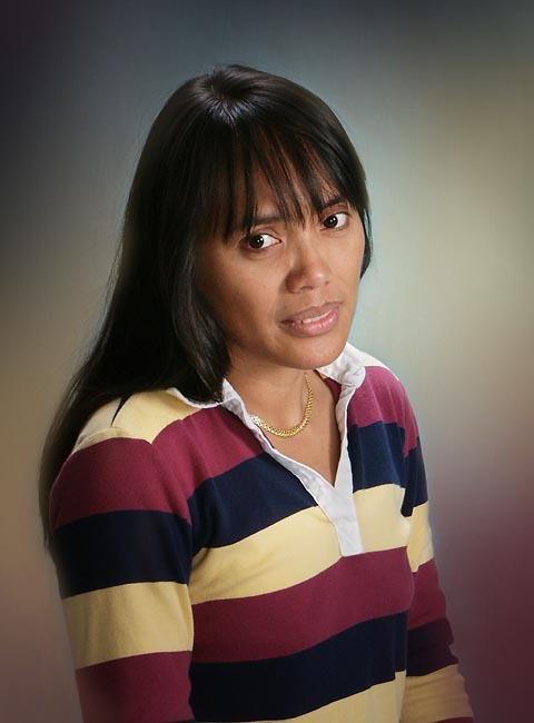
What to do when the subject walks in wearing a multi-color striped rugby shirt? This test shot below of my ever reluctant in-house model was an experiment to minimize the effect of a horrible clothing choice. In photoshop I sampled the shirt, blew it up and blurred it to try to create a background with the same colors in an attempt to make the brain tune out the shirt as part of the background. Did it work? You be the judge.
Key Points to Remember
- Clothing is the only variable which cannot be controlled by the photographer in the studio environment. Key the background to blend as harmonious as possible with the clothing and use back/rim accent light to provide separation as needed.
- Contrast the center of interest, the front of the face in a portrait, with both the clothing and the background. The greater the contrast, the stronger the attraction to the face area will be. Modulate the flow of the viewers eye with the gradation of tone from edge-to-center. Ideally the progressive tonal path should lead the eye over everything of secondary interest such as feet, hands, props, jewelry, cleavage, naughty bits if exposed, etc. ON THE WAY TO THE FACE. The reasoning is simple, if they see it on the way in, the face is more likely to hold their attention longer when they find it; especially when those naughty bits are exposed.
- Handle bright distracting clothing with balance, by putting center of interest between two colored areas; or with camolflage, surrounding the center of interest with so much of the distracting color it contrasts.
- Eliminate distractions which are similar to and compete tonally with the center of interest. Do not create leading lines to nothing interesting or out of the frame. Nothing in the photo should be more eye catching than the eye area of the subject's face if you want the viewer to make and hold eye contact with the photo.
- Use negative space to create a visual buffer and provide composition balance to the entire photo. Use a mat when you can't do it in the photo.
Holistic Concepts for Lighting
and Digital Photography
This tutorial is copyrighted by © Charles E. Gardner. It may be reproduced for personal use, and referenced by link, but please to not copy and post it to your site.
You can contact me at: Chuck Gardner
For other tutorials see the Tutorial Table of Contents