Primer
The science of color management started in the late 1800s in the textile and printing industries. By the 1930s the a mathematical model of how the human eye was created which represents the range of color humans can see. That model, called CIE*Lab defines colors in three dimensions consisting of a vertical "L" channel containing a monochrome record of the detail, and two horizontal color axes: "a" for amber/blue color information, and "b" for green/magenta color information.
The goal of color management is a tool for predicting reproduction results, not matching screen and monitor. Camera sensors and monitors record and display color in Red, Green, and Blue values. Printers use Cyan, Magenta, and Yellow inks. What color management does is allow the RGB monitor to simulate PERCEPTUALLY how the color will change when it is printed.Color will change when printed
Accept it
and learn to predict how much
Selecting an Editing Space
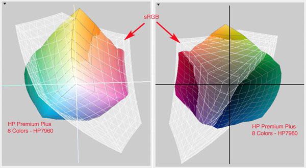
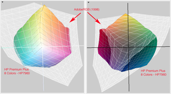
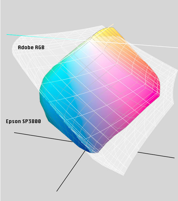
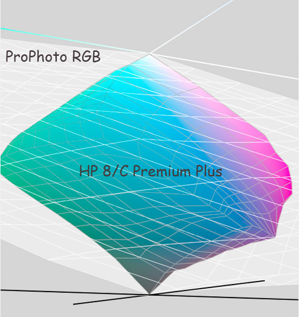
This discussion will assume we are shooting RAW files in the camera. When first opened in the RAW editor an editing color space or "working" gamut will be assigned to the file. Each pixel in the file will be assigned an Lab coordinate defining how it fits into the range of human vision, and an RGB value based on its position in the working gamut. The typical choices are sRGB, AdobeRGB and ProPhotoRGB, but what do they actually represent? The 3D wireframe comparisons below provide important clues:
This first comparison shows how the gamut of my 24" iMac monitor compares to sRGB and AdobeRGB:
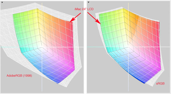
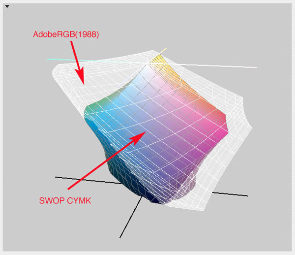
The monitor gamut fits inside sRGB almost perfectly which means the monitor can accurately display all the colors in an sRGB file. The AdobeRGB gamut is larger and can represent colors which are more saturated than monitor can display accurately. So why is AbobeRGB a better choice than sRGB for editing? The answer comes from comparing printer gamuts with the two editing gamuts.
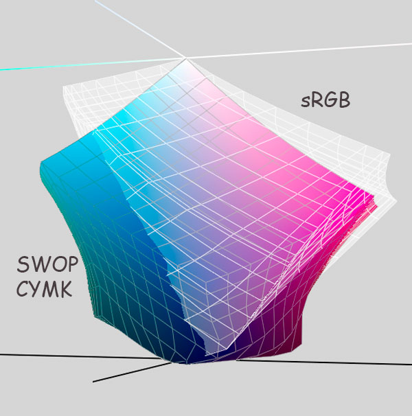
The wireframe below shows a comparison of sRGB and SWOP (Standards for Web Offset Printing) CYMK printing on commercial grade publication paper:
Practical Application of Color Management
For most of my professional career I managed printing plants and in recent years we have used an ICC based color management workflow. Color management for printing starts with the output devices and works backwards to allow the display to simulate the limits of the output. The goal for soft proofing is to have the screen accurately simulate printer output, in effect forcing more saturated colors of the monitor to look as "bad" as the print will.
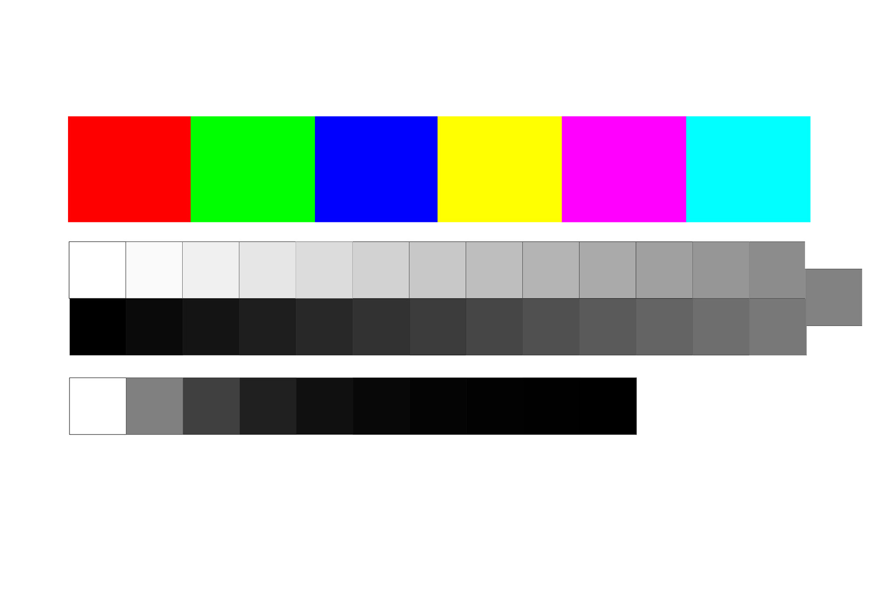
The management process starts by profiling the printer using a target with as many as 900 different color patches and then comparing how the printer ink/paper reproduced them with how they would look if reproduced optimally "per the numbers". The gamut of a printing device is dictated by the physical characteristics of the paper and pigments. The red, green, blue phosphor / LCD pixel on your monitor will usually be capable of reproducing much more saturated reds, blues and purples than any paper / pigment combination because the inks are actually transparent and magenta and cyan pigments are cross contaminated. The resulting printer profile, when used for soft proofing, provides a "roadmap" telling the monitor how to desaturate its color and lower its contrast on screen to simulate how the print output will look. The equipment needed to create an accurate printer profile is very expensive and require a good understanding of color management to operate correctly. What you really need to know in tangible terms is the maximum saturation of key reference colors your printer is capable of reproducing. I created the test target below in Photoshop using ProPhoto editing space with maximum RGB values for the primaries and R+G, R+B and G+B for the yellow, magenta, and cyan. The top gray scale ranges from 255 to 0 in 10 unit increments 255, 250, 240, 230...20, 10, 0. The bottom scale is a binary progression 0, 1, 2, 4, 8, 16...128, 255. Click on the small image below to view and download a 1200 x 1800 pixel file in ProPhoto you can send to your printer to explore the limits of its gamut.
The Eye Is the Weakest Link in the Process
The ironic thing about color management is that while its necessary for process control and predictable consistency image-to-image the human color perception is so adaptable that a wide range of color will look normal. If you put two images side-by-side you will be able to immediately detect which has the most saturated color. But put them in different rooms and look at one then the other and the difference will be less apparent. The background context also changes perception. Take two copies of the same photo and mount one on a wide black mat and the other on white and they will look different.
The best axiom for color management is: less is more. If you don't know how it works on a technical level and have the tools necessary to create accurate custom printer profiles you are better off letting the printer manage the color. After all the engineers who designed your cameras, monitors and printers DO understand color management and if you don't muck around and make changes based on what is seen on the monitor, a well exposed file with neutral color balance should produce images which look real PERCEPTUALLY on screen and print.Use Your Camera As Your Color Management Baseline
Buy a commercial gray card, use it to set custom WB and then take some photo with the card, a white towel and a black one in them as references. The fact the WB is known to be neutral on the card and the fact Custom WB makes the camera files neutral means that they should look normal perceptually on your monitor and printer. That is after all how color management is supposed to work isn't it?
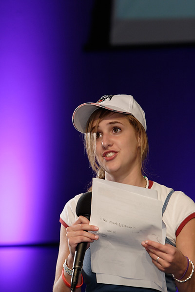
Open the files on your monitor. They should look normal with the white, gray and black objects neutral and all the other colors "normal" as seen by eye. If they don't it tells you your monitor isn't calibrated properly. Trust your eyes and your camera WB, not some hockey puck gizmo which changes your monitor settings automatically. After all how well does auto anything ever work. Next without doing anything except converting from RAW send the file to your printer, letting it manage the color. Like the screen image the print should reproduce the scenes in the photos in a way that looks "normal" perceptually if you managed to exposed them with detail over the entire tonal scale. Don't compare the color saturation of the red car in the photo to the image on the screen, compare it to the red patch in the test file above you printed previously. If the car in the photo is as saturated as the 100% red patch on the test file you will know the printer did the best it could: you can't expect to get Ferarri red with a Toyota printer... After doing that exercise try it again, this time using all your file editing and color management chops. See if the results are any better than the camera and printer will produce if left to manage the color themselves. You may come to the realization that the equipment isn't the source of your color management problems.Soft Proofing
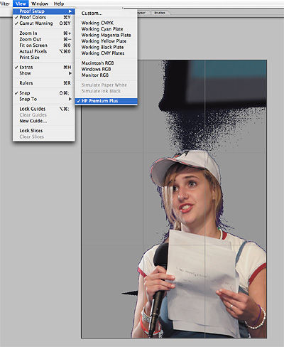
In Photoshop "Soft Proofing" used the printer profile to alter the appearance of the screen image to alter the alter the output characteristics of the monitor to simulate the printed results. In essence it provides a preview of how the print will differ. Being able to pre-visualize the changes will lower expectations of what the final printed product will look like. While that might not make much sense in the context of taking a photo of the wife and kids, if you were shooting a ad for Coke or some other product with a distinctive logo color you'd want the client to know if and how the color might change.
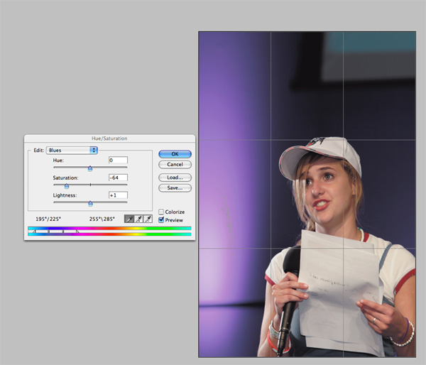
To display file on a monitor the ICC based color management re-maps any highly saturated colors to the more limited range of saturation your monitor can display so PERCEPTUALLY what you see on the monitor appears to have the same range of tone and contrast you'd experience in person looking at the same scene. When you apply the printer profile between the file values and the monitor the printer profile will cap the saturation of the screen image to that which the ink and paper can reproduce. The Catch-22 and Achilles Heel for soft proofing is the limit of the monitor gamut. If you edit on a consumer grade LCD monitor or laptop your "window" on the color values which actually exist in the file are rather limited to a gamut similar to sRGB or even smaller. So while you have mapped the camera color values to the rather large AdobeRGB working space, what you are seeing during normal editing are any more saturated colors than your monitor can reproduce remapped to fit the gamut of the monitor in a way that makes the overall contrast and saturation of the image look good PERCEPTUALLY. The large the gamut of the monitor the more accurately it will be able to mimic the gamut of the printer. But as the wireframes above show, even a monitor capable of displaying the entire AdobeRGB gamut isn't large enough to display an 8/C printer gamut. Normal viewing: RAW capture > Conformed to Adobe RGB > Conformed to Monitor Profile = what you see on screen Soft proofing: RAW capture > Conformed to Adobe RGB > Conformed to Printer Profile > Conformed to Monitor Profile = what you see So in effect the printer profile is acting like a frosted filter on a lens would to cut the contrast and saturation of what is in the file to what the printer can produce. As the printer vs monitor wire frames reveal there may be some saturated colors in the file the printer can reproduce but the monitor can't. So what happens when the printer profile filtered values are passed to the monitor driver for display the monitor profile will clip them to the limit of what the screen can show... Here's a screen shot with colors in the background which a printer gamut will clip, viewed in normal editing mode...
Conclusions:
I understand how the color management process works on a technical level but don't obsess over it. Quite to the contrary. I realize goal of the exercise isn't matching monitor to printer its wringing as much color out of every device a photo is reproduced on to make it seem as real as possible. The most important thing I've learned working in color reproduction is the weakest link is human perception. Color management is about is managing perceptual expectations so every step of the reproduction / display process makes the images look "normal" perceptually. Perception is based on anchor tones and memory colors. Absent a side-by-side "pixel peeping" comparison a wide range of color reproduction will look normal.
Holistic Concepts for Lighting
and Digital Photography
This tutorial is copyrighted by © Charles E. Gardner. It may be reproduced for personal use, and referenced by link, but please to not copy and post it to your site.
You can contact me at: Chuck Gardner
For other tutorials see the Tutorial Table of Contents