A White Background
Perceptually
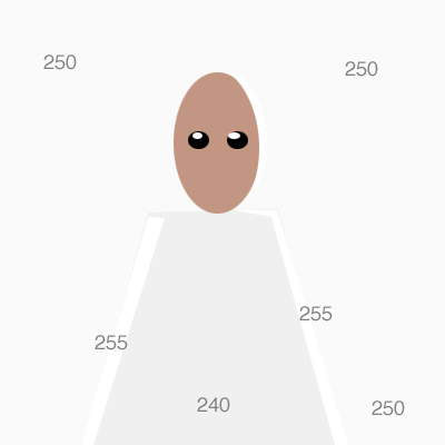
Consider if the subject in the foreground was holding a piece of the white background seamless paper next to their face with only the key and fill lights on. When the exposure for the face was correct the paper would be reproduced as white wouldn't it? Not 255.255.255 blown out white, but 250 which makes it look like what it is, a piece of paper not a direct light source or specular reflection.
While "nuking" a background is a common practice it is a poor strategy perceptually because any white object in the foreground will seem darker and duller by comparison. Perception is a relative thing. When looking at a scene or photo the brain will key off the lightest and darkest areas it sees to anchor the perception of overall contrast. The background, by virtue of being largest, set the "key" and contrast dynamic in the photo. On a predominantly dark background the viewer will be naturally attracted by contrast to the lightest areas. On a white background it will be the darkest and more colorful areas which tug at and lead the eye.
I set my lighting based on the perceptual goals of the photograph. In the example below I was setting lights for a butterfly configuration with a back-rim light component. For the rim light to work perceptually to create the illusion of 3D it must contrast with both the white background and any white objects in the foreground.
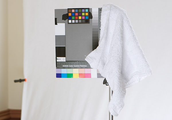
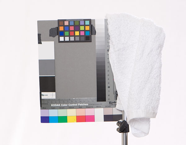
To maintain the illusion of 3D shape and separation the background tone must fall below that of the rim lit towel. The darker the background is relative to the rim-lit edge and darker front of the towel the more realistic the foreground looks. Contrast and perception of "white" is a relative thing. The brain will tune out the background immediately if the foreground is compelling, so the fact the background isn't "pure" white will not be noticed.
Let the important content in the foreground dictate what tone the background must be to allow it to contrast in look more realistic.
Holistic Concepts for Lighting
and Digital Photography
This tutorial is copyrighted by © Charles E. Gardner.
It may be reproduced for personal use, and referenced by link, but please to not copy and post it to your site.
You can contact me at: Chuck Gardner
For other tutorials see the Tutorial Table of Contents