Part Seven - Color Management
by Chuck Gardner
|
The Evolution of Desktop Color Standards 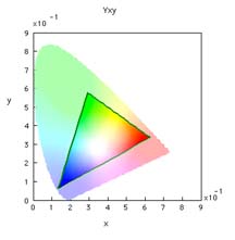 In the early
days of desktop color there were no benchmarks or standards.
Apple, targeting the graphic arts market, factory calibrated
its monitor to simulate the contrast and appearance of
printed paper. In technical parlance the Apple monitor had a
contrast ratio (i.e., Gamma) of 1.8 and a white point of
6500 degrees Kelvin. The white point color temperature was
higher (i.e., less warm) than the 5000K printing industry
viewing standard. The range of colors, or gamut, of the Apple monitor
could reproduce was defined by the phosphors in its
Sony-supplied Trinitron CRT tube. This gamut was far
smaller than the range of human perception, as show by the
green borderon the two dimensional CIE Yxy plot. In the early
days of desktop color there were no benchmarks or standards.
Apple, targeting the graphic arts market, factory calibrated
its monitor to simulate the contrast and appearance of
printed paper. In technical parlance the Apple monitor had a
contrast ratio (i.e., Gamma) of 1.8 and a white point of
6500 degrees Kelvin. The white point color temperature was
higher (i.e., less warm) than the 5000K printing industry
viewing standard. The range of colors, or gamut, of the Apple monitor
could reproduce was defined by the phosphors in its
Sony-supplied Trinitron CRT tube. This gamut was far
smaller than the range of human perception, as show by the
green borderon the two dimensional CIE Yxy plot.
From 1988 until the introduction of color management in 1995, the de-facto industry standard for RGB color was a 13" Apple Macintosh monitor. Most stock photos produced prior to 1995 were color balanced to look good on the Apple 13" monitor "color space", but consistent appearance from computer-to-computer required that all monitors be calibrated for identical output. A software program called, "Kroll Gamma Control Panel" was created to address this need. It used visual comparison of targets to set brightness and neutral color balance. The Radius Pressview Monitor - ColorMatch RGB 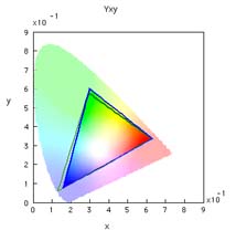 As the professional graphics arts industry
embraced PhotoShop, the Radius Pressview monitors and
videocard, which together cost over $3,000, replaced the
Apple 13-inch monitor as the de-facto desktop color
standard. A PressView monitor has a gamma of 1.8, which like
the Apple monitor closely matched the contrast of ink on
paper. Its higher quality phosphors displayed a slightly
different range of colors than the Apple Monitor, as shown
by the blue border on the CIE Yxy diagram. The Radius
Pressview monitor slightly expanded the range of yellows and
greens a monitor could display but a more limited range of
purple hues. As the professional graphics arts industry
embraced PhotoShop, the Radius Pressview monitors and
videocard, which together cost over $3,000, replaced the
Apple 13-inch monitor as the de-facto desktop color
standard. A PressView monitor has a gamma of 1.8, which like
the Apple monitor closely matched the contrast of ink on
paper. Its higher quality phosphors displayed a slightly
different range of colors than the Apple Monitor, as shown
by the blue border on the CIE Yxy diagram. The Radius
Pressview monitor slightly expanded the range of yellows and
greens a monitor could display but a more limited range of
purple hues.
Most significantly the Pressview monitor had a 5000 K white identical to the publishing industry standard for viewing color proofs. This made it possible to place a sample printed on coated paper in an industry standard 5000 K viewing booth next to a Pressview monitor and get a reasonably good match on screen to the look of ink on paper. The 1500 degree shift in the white point from the previous de facto Apple Montor color standard created a dilemma. A color subject visually balanced to have a pinkish caucasian skintone on a 6500 K monitor would look jaundiced when viewed on a 5000 K pressview. If that was not bad enough, Intel-based PCs with color monitors which had higher contast (2.2 vs 1.8 gamma) and higher color temperature had arrived on the scene, further complicating things. Goto Next Page > Goto < Previous Page Goto Class Outline Goto super.nova.org my home page. |