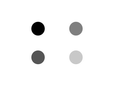
I've created this visual perception exercise to illustrate the points I make about using tone to lead the viewer's eye to the center of interest in a photo. I've used dots rather than a photo to keep the exercise content neutral.
These first two illustrate how the eye will naturally gravitate to the darkest spot on a white background or the lightest one on a black one.


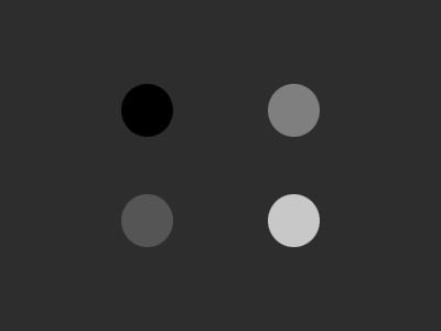
Here are four different tones, all sitting on 1/3 nodes to give them equal compositional visual attraction or "weight". The dots are identical in both. The lightest tone is RGB = 200,200,200 not 255,255,225 white. The only variable between the two is the tone of the background. To my eye the black dot is most attractive on the white background, and the light one on the dark, but not nearly as much as the first set because there are other similar tones competing for the attention of my eye.
Here are the same dots on a middle gray, 127,127,127 background. To my eye this is a bit of a muddle since none of the dots really dominates tonally. I find my eye bouncing back and forth between the darkest and lightest, and pretty much ignoring the other two.

Now a pure white dot is added. My eye is pulled directly towards it from left to right, then out of the box to the right. Visually attractive but too close to the edge to keep the eye in the frame.

Same dots, but this time the white one is adjacent to the darker ones, with other more similar tones some distance away. Here I find my eye attracted to white dot the most, but then pulled away from it over to the next brightest tones.

Here the large dot is my intended center of interest in the composition, but I've let a couple of stray bright highlights creep in. My attention is diverted from the COI by the brighter competing distractions.

Here's another visual tennis match. Two center of interest which are equal in size, color, and compositional "weight" on rule of thirds nodes pull the eye equally two different ways.

>Something that I've observed while critiquing photos it that when multiple centers of interest are on or within the rule of thirds nodes the eye tends to move smoothly between them. But when strong centers of interest fall outside the invisible inner border formed by dividing the frame into thirds as shown below the eye will be forced to dart between them creating conflict regarding which to look at.

Thus if a smooth harmony between multiple centers of interest such as the heads in a group photo keep them close together in the center of the photo. But if you want to create a sense of tension such as two people confronting each other make them equal visual "weight" and put them outside the 3rds line towards the edges. frame into thirds as shown below the eye will be forced to dart between them creating conflict regarding which to look at.

But change the tonality of one of the dots and the eye is drawn directly to the darker one due to its stronger contrast with the background. If is was a dark background which dot would be most attractive?

Finally, this illustrates that tonality is only one variable in determining the visual "weight" of an object. Here the fact the lighter object is larger, a different shape, and closer make it dominant, even on a white background.

Multiple Centers of Interest - Case Study
Portrait photographers are frequently confronted with challenges like the one illustrated below. A couple wants a photo with their white dog. Their clothing doesn't match each other or the background and the white dog because it is so bright will contrast the most and attract the most attention in the photo.

When I look at a scene like this I first do a rank order inventory of everything which attracts my attention based on tone and color.
Here's how I'd score that one:
- White dog
- Cyan shirt on left
- Faces
- Bright hand on shoulder
- Hands under dog
- Background
- Burgundy shirt
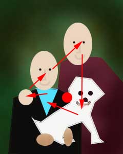
Next I note the path my eye travels in the photo as it moves between the most attractve areas and a point of balance between them, represented by the red dot. That point of visual balance in the middle of the path the eye travels in the photo becomes the "virtual" center of interest. Virtual because it is not any one of the individual centers of interest, but rather a point of visual equilibrium between them.
The illustration above is based on a photo I recently critiqued and illustrates what I teach in my tutorial Background and Clothing Considerations. It teaches how to deal with distractions like the white dog. In this case I suggested hiding the dog in plain sight by changing everything in the photo except the warm toned faces of the people, who both had gray hair, to a monochromatic color scheme:
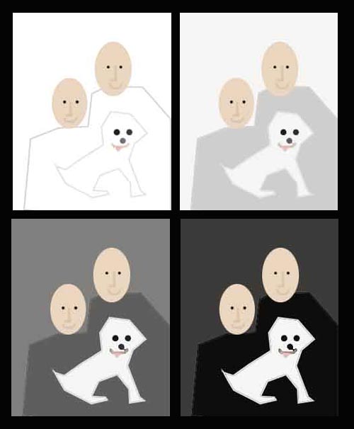
The only difference between the four versions above are: 1) the tone of the clothing, and 2) the background tone. Altering the relative contrast between the faces, dog, clothing and background shifts the visual balance point and "virtual" COI in the photo.
Look at each one and let your eye settle on a balance point between the faces and the dog.
The point of this exercise has been to understand how best to lead the viewer's eye to your desired center of interest (COI). The easiest way to do that is to make the COI the most visually compelling area in the photo in terms overall visual "weight" and contrast with the dominant background tonality. Contrast with the background is the key factor which will attract the attention of the viewer in the photo.
Equally important the exercise illustrates how objects which are more visually compelling that the COI, such as a white shirt on a dark background, can overpower and distract from the intended center of interest.
Holistic Concepts for Lighting
and Digital Photography
This tutorial is copyrighted by © Charles E. Gardner. It may be reproduced for personal use, and referenced by link, but please to not copy and post it to your site.
You can contact me at: Chuck Gardner
For other tutorials see the Tutorial Table of Contents